Citizen Kane.”>
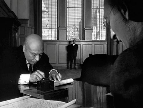
Deep focus mise en scene from Citizen Kane.
When it comes to a making a movie, the arrangement of a scene has a huge impact on the audience’s perspective. If the audience is intended to feel a particular emotion, or notice a particular detail, mise en scene visually does the work. Without putting proper thought into these aspects, many key opportunities are missed, thus lowering the value of the scene and reducing its potential. It is important to pay attention to detail, no matter how insignificant it may seem. The layout of a shot gives it power and speaks volumes. Mise en scene allows the film to make statements and ideas without needing obvious, forced scenes full of information. A script receives its full value when mise en scene is properly utilized.
Mise en scene is the arrangement of a scene or a setting in a movie, play, or other production. Mise en scene involves everything seen before the camera – the set, the lighting, the directions, the costumes, the actors, the props – every detail the audience can see. Mise en scene is meant to envelop the audience and bathe them in reality. How can a production be believable without the natural details?
Analyzing mise en scene in movies is important in order to grasp the idea behind each and every fine detail. With every motion and prop there is a deliberate purpose. Can you tell what it is? How does it affect perspective on the characters? Is the movie drawing the focus onto a particular aspect? Does this seem relevant? Will it end up being relevant? How did the camera angle affect the outcome of the scene? What lens was used to shoot?
In the following piece, we are going to explore the fifteenpoints of mise en scene that are absolutely necessary to think about. These points include: dominance, lighting, shot and camera proxemics, camera angle, color values, lens/filter/stock, subsidiary contrasts, density, composition, form, framing, depth of field, character placement, staging positions, and character proxemics.
Throughout these fifteen points, we will explore what catches the eye in a shot, how lighting effects the audience’s perspective, how the shot’s proximity matters as well as the angle, the importance of color, what lenses are best, proper organization, framing, location of the characters, and a great deal more.
Carrying through the examples and explanations will be a shot from Ghost World, a film created in 2001. This image provides an excellent basis off of which the fifteen points can be formed and explained utilizing a visual representation. This image allows the ability to ask questions about something already existent, in order to provide a better sense of the effects of the ideas discussed. For example, we will assess the lighting in the shot provided and how it affects the film’s genre.

